A story about why the digital planner in 2026 should move onto a dedicated display.
This story is based on real experiences inside our company — how we plan work, build focus, reshuffle priorities, and gradually arrive at the idea that the digital planner in 2026 should become not just an app, but a visible part of the environment.
When you open your calendar on a Monday morning, it may seem like everything is under control. Meetings are scheduled, tasks are organized, reminders are working, documents live inside Notion, events sync through Google Calendar, task lists update in Todoist, and the AI tools that have already become part of daily life offer increasingly convenient workflows. At first glance, modern digital planners appear to do exactly what they were designed to do: structure the day, organize time, and help you avoid forgetting important things.
But after a few minutes, something becomes clear: the day barely belongs to you anymore. In fact, it becomes difficult to tell who it belongs to at all.
Not because you lack a system. The system exists. You may even have several systems running simultaneously. One digital planner manages personal tasks, another digital planner structures the workweek, a third tool stores documents, a fourth tracks deadlines, and a fifth proposes AI-driven “optimization” of your schedule. Everything looks rational, modern, polished — and even relatively affordable.
The problem is different: the more tools you add, the harder it becomes to see the day as a whole, and even harder to see what truly matters.
By 2026, digital planners are no longer something new. They have become a foundational part of work, family life, and business. Digital planner apps exist inside phones, browsers, email clients, CRMs, task managers, operating systems, and even smartwatches. Everyone has a calendar. Everyone has a task list. Everyone has reminders. Yet many people still begin the morning with the feeling that they are not managing time — they are merely reacting to it.
You open your digital planner to understand the day, but instead you see a dense wall of events. You open your digital planner to choose what matters most, but messages, emails, notifications, and requests immediately appear beside it. You want to make a calm decision, yet every screen turns into an inbox.
This is how the digital planner slowly stops being a map of the day. It becomes just another window inside the larger digital noise.
This is exactly what we began noticing ourselves — and exactly what we want to change.
We did not build this theory in abstraction. Every workday provided evidence. Meetings were rescheduled, priorities shifted, client requests suddenly became urgent, suppliers waited for answers, marketing demanded decisions, development teams needed clarification, while family matters quietly moved to the evening — and then to the next day. You probably recognize this pattern. We had the tools. We had almost every digital planner available in 2026. We had lists, documents, reminders, and boards. Yet the most important things still disappeared from view.
Not from the system. From attention. That distinction matters.
When an event is written into a digital planner, it formally exists. When a task is added into a digital planner, it is technically not forgotten. But there is a massive distance between “recorded” and “visible.” And another distance between “visible” and “able to influence behavior.”
In business, that distance is expensive.
One meeting without an agenda destroys an hour of focus. One “quick call” breaks deep work. One urgent client response pushes aside a strategic task. One postponed family dinner feels insignificant — until those postponements become a pattern. A day may look completely full, yet by evening it becomes difficult to say what actually moved forward.
And eventually the question appears: if the digital planner shows everything, why does it still fail to reveal what matters most?
The answer is uncomfortable, but simple. Because the digital planner usually lives in the exact same environment as distractions — inside the very architecture designed to fragment attention. If you want to call it something, it is distraction by design. The digital planner lives inside the phone, the laptop, the browser, email, messaging apps, tabs, and notifications. A digital planner may be brilliantly engineered, but if it exists inside an environment constantly competing for your attention, its power remains limited.
You open your digital planner on your phone — and ten seconds later you notice a Signal message. You open your digital planner in a browser — and nearby are tabs, emails, analytics dashboards, news feeds, orders, invoices, and tasks. You intended to review your day, but instead you fall into a workflow stream. The result is paradoxical: the very tool meant to create clarity exists inside an environment engineered to create overload.
At some point, we stopped asking: “How do we build yet another digital planner?”
The question itself changed: “Where should the digital planner live if it is meant to genuinely influence behavior?”
Its purpose should go beyond simply storing events.
More than just delivering reminders or acting as another synchronization layer between apps.
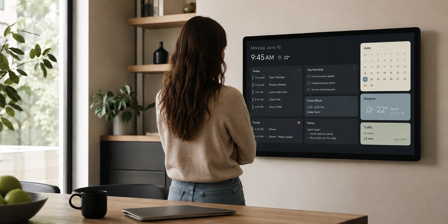
The digital planner needs to remain visible precisely when decisions are being made.
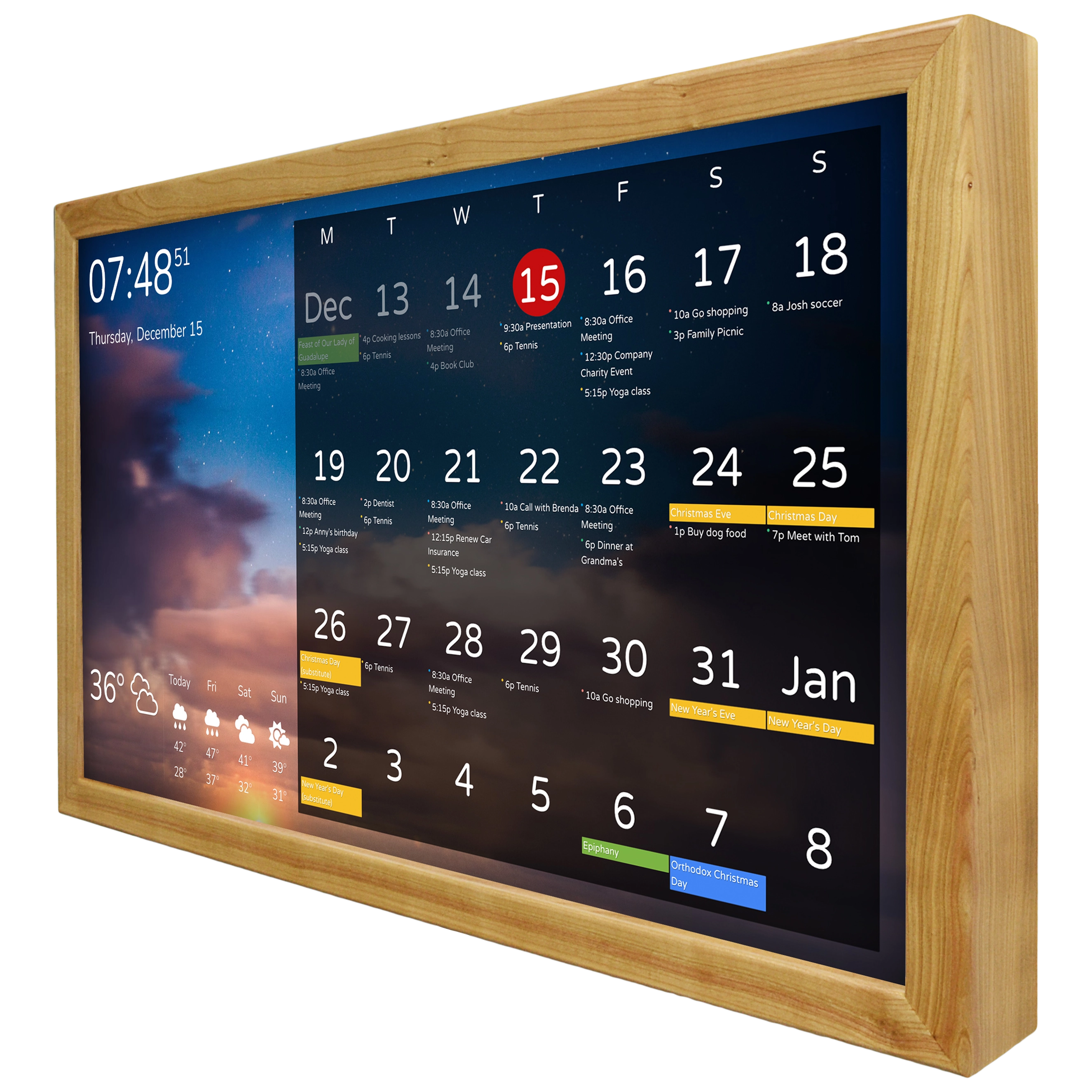
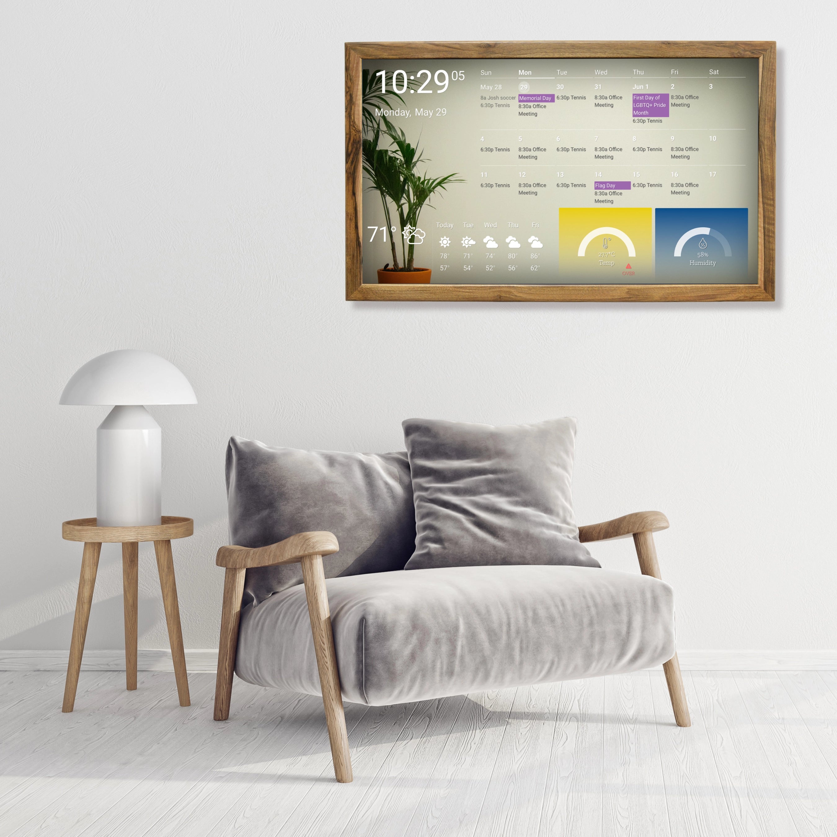
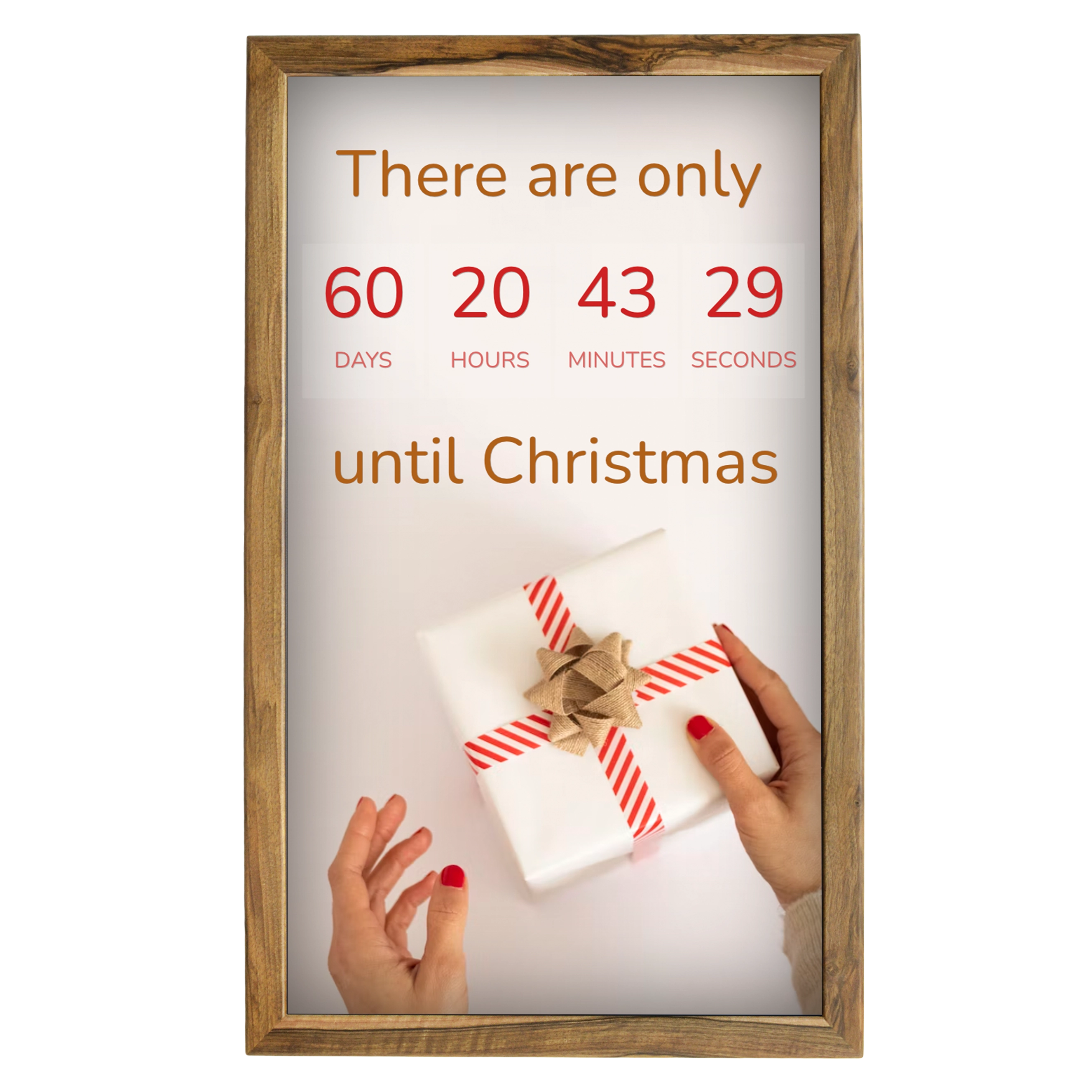
That is how the idea of a dedicated digital display emerged.
At first, the idea felt almost too simple. If the digital planner already exists inside the phone and computer, why introduce another screen? If the digital planner is already available through an app, why move it onto a wall, a desk, or a kitchen display? Wouldn’t it become just another decorative duplicate of something that already exists?
The skeptical question is valid. A display alone solves nothing. A bad digital planner on a larger screen remains a bad digital planner. An overloaded digital planner mounted on a wall remains overloaded. If all you do is stretch an app interface onto another display, the benefit will be minimal.
But the value of a dedicated display is not its size.
Its value is context.
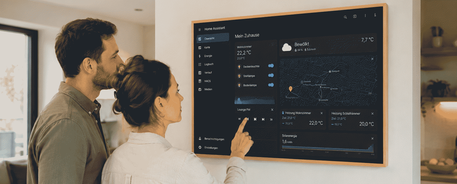
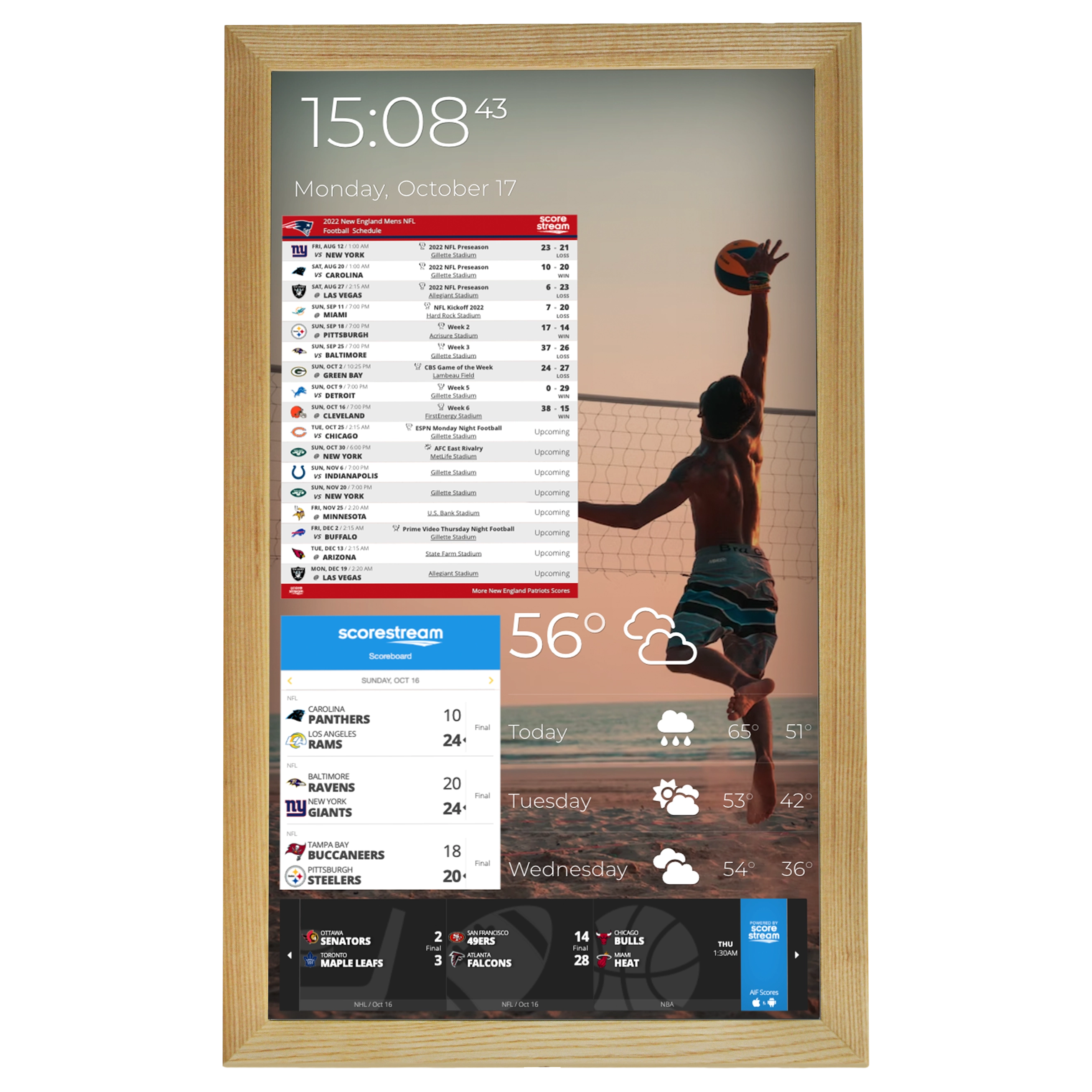
A phone is a reaction device. A laptop is a work device. A browser is a search-and-switching device. But a dedicated display can become a visibility device. On it, the digital planner no longer competes with messaging apps. The digital planner no longer drowns inside browser tabs. It does not require unlocking a screen, opening an app, selecting a view, and remembering why you entered it in the first place.
- It simply exists.
- In the kitchen.
- In the home office.
- Inside a meeting room.
- At the reception desk.
- In a workshop.
- In a team space.
In the places where the day begins — and where decisions are shaped not only in the mind, but within the environment itself.
Once the digital planner appears on such a display, it stops being a hidden database. Once the digital planner remains visible throughout the day, it stops being a list you must intentionally revisit. It becomes part of the environment.
And that changes behavior.
You no longer simply accept another meeting. You see that it destroys your focus block.
You no longer casually postpone a task. You see that it has already been postponed for the third week.
You no longer automatically agree to an evening call. You see that it occupies the space reserved for family time.
You no longer hope to revisit your digital planner later. It is already in front of you.
You no longer rely entirely on memory. The digital planner quietly holds what matters.
This is where the real product idea begins.
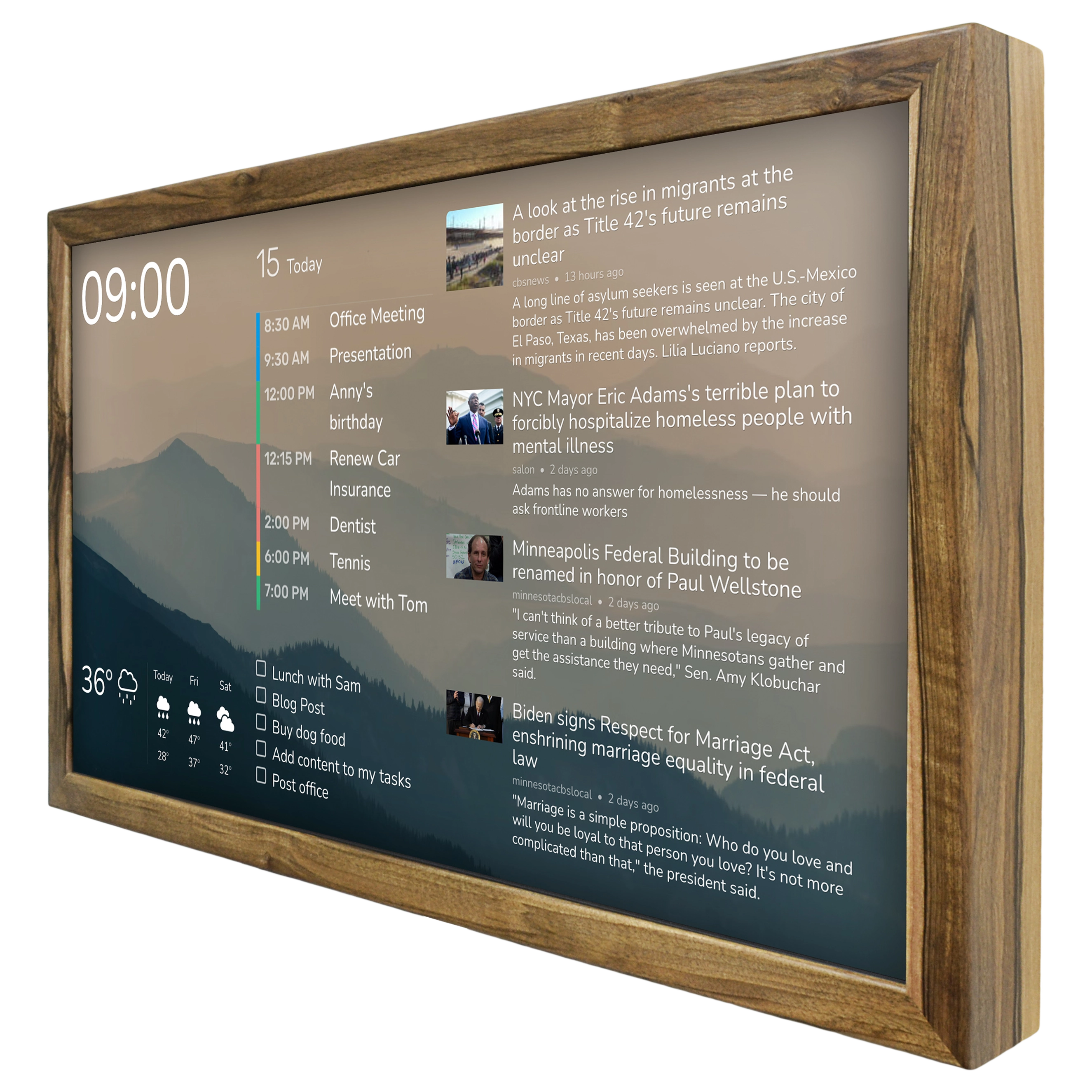
The digital planner in 2026 should not simply be a calendar. The digital planner in 2026 should not merely be a task list. It should become a visibility system: a system that reveals not only what is scheduled, but also what is being displaced, what conflicts, what loses priority, and what remains invisible for too long.
Such a digital planner should not scream for attention. It should not turn a wall into the control panel of a spaceship. It should not attempt to display everything. On the contrary, its strength comes from selective visibility — from showing only what deserves to remain in front of your eyes, and allowing you to decide what that is.
Today’s highest priorities.
Upcoming meetings.
Free focus windows.
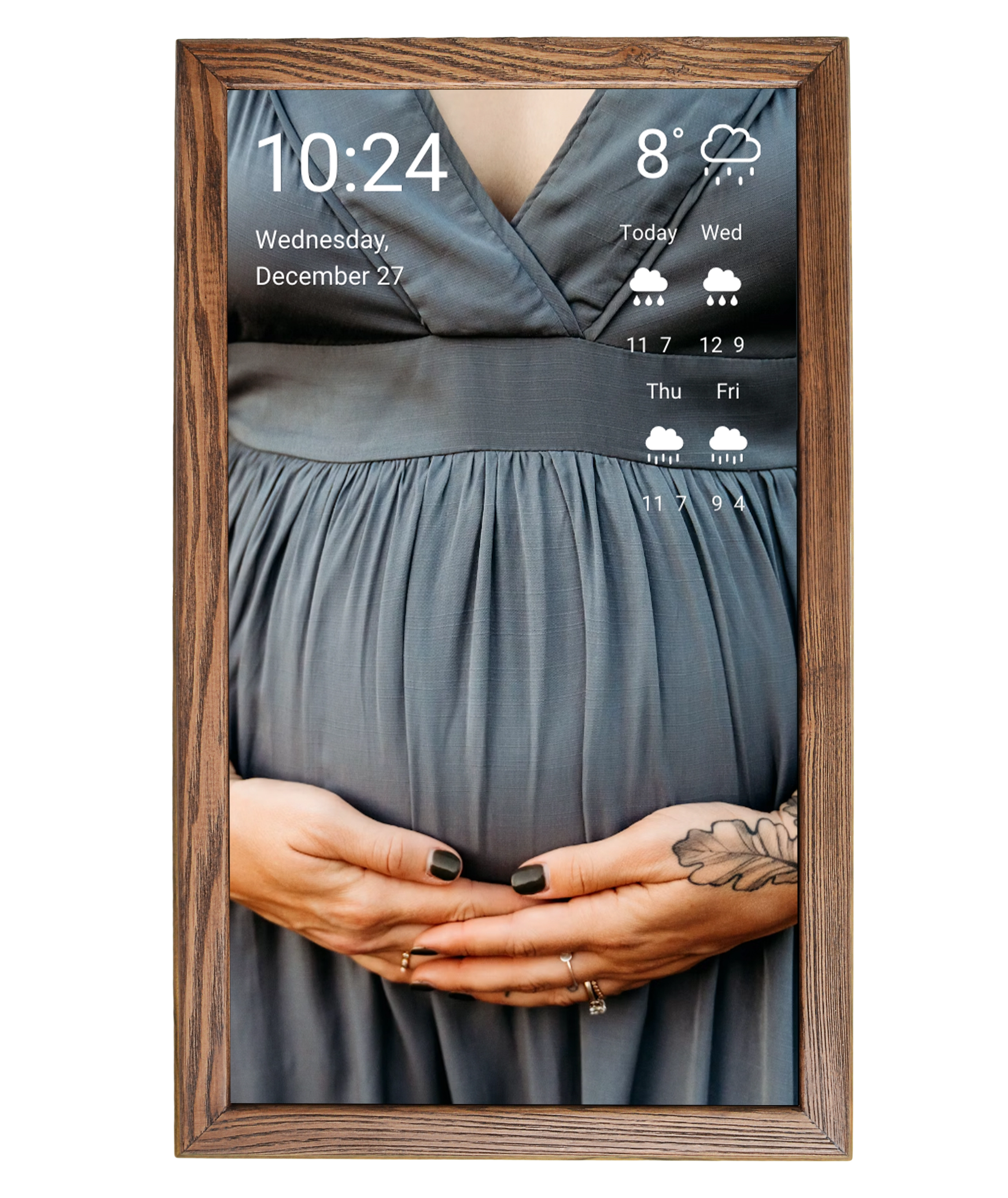
Family or team events.
Context: weather, traffic, deliveries, reminders.
Conflicts: what overlaps, what keeps being delayed, what requires a decision.
One central question for the day: what must not disappear from view today?
This is not a fantasy about a future where AI controls human life. In many ways, it is the opposite. A good digital planner should help people see their own decisions again. A good digital planner should not take control away — it should return it.
AI can reorganize a schedule. But AI does not always understand why a particular evening matters.
A task manager can store a task. But it does not always reveal that the task has become chronically postponed.
A calendar can accept a meeting. But it does not always show the price you pay for saying yes.
A digital planner can be precise. But precision without visibility does not guarantee control.
A digital planner can be functional. But functionality without attention eventually becomes an archive of intentions.
That is why the dedicated display changes not only the interface, but the role of the product itself.
An application is a place you actively enter.
A display is a place already beside you.
An application demands action.
A display creates presence.
An application competes for attention.
A display returns attention.
When the digital planner exists only as an app, it depends on your discipline. When the digital planner is moved into visible physical space, it becomes a soft external constraint. It does not force behavior. It quietly reveals reality. Often, that alone is enough to change a decision.
You see that the day is already overloaded with meetings — and decide not to add another unnecessary one.
It makes is visible that your focus block is the only one available that day — and protect it.
Straighforward and clear message that a family event is once again under threat — and you might decline the evening call.
You see that an important task has remained untouched for too long — and finally allocate real time for it.
In this way, the digital planner becomes more than a scheduling tool. It becomes a way of having a conversation with yourself.
The digital planner in 2026 stops being merely a productivity tool and becomes a tool for honesty.
For business, this matters even more.
Company strategy rarely collapses because a single document is missing. More often, it dissolves through thousands of small calendar decisions. A leader says the product matters, but their week consists entirely of agenda-less meetings. A team says focus matters, yet nobody protects long uninterrupted work blocks. A company claims customer experience is important, but support teams drown in reactive tasks. A family says evenings matter, yet in the ecosystem of digital planner apps, evening time continuously loses to urgent calls.
A schedule is not just a schedule.
It is strategy written into time.
And if the digital planner fails to reveal that strategy, it performs only half its job.
When the plan becomes visible on a dedicated display, another level of accountability appears. Not aggressive accountability. Not corporate pressure. Not imposed control. Simply visual accountability. The team sees what fills the day. The family sees what is happening tonight, tomorrow, and next week. A business owner sees where decision-making space still exists. A person sees what their life is actually filled with.
In this sense, the digital planner becomes closer to a dashboard — though not an automotive or analytical dashboard. More like a calm status window. It does not demand interaction every five minutes. It does not transform planning into a game of streaks, points, and alarming red notifications. It simply shows: here is today, here is what matters, here are the risks, here are the open spaces, here is what must not be forgotten again.
We did not arrive at this conclusion immediately.
At first, the instinct was to use every available feature. More widgets, more integrations, more settings, more display modes. That is a natural engineering reaction: if functionality exists, use all of it. But gradually it became clear that a wall-mounted digital planner display wins not through the number of modules it shows, but through the quality of selection. A digital planner on the wall becomes useful not when it displays everything, but when it helps prevent the important things from disappearing.
For a household, that may mean the shared family day: work, school, appointments, deliveries, weather, dinner time, reminders to bring sports gear.
For an entrepreneur: priorities, calls, focus blocks, client issues, financial deadlines, personal time.
For a team: meeting room schedules, shifts, important releases, statuses, and shared daily context.
For a reception area: visits, events, notifications, weather context, and guest information.
In every scenario, the digital planner performs the same function: it makes the day visible.
And in every scenario, the digital planner solves the same problem: it protects priorities from the digital noise that inevitably accompanies phones and laptops.
This leads to the central formula:
- A plan hidden inside a phone is easy to ignore.
- A plan buried in one of twenty browser tabs is easy to lose.
- A plan that lives only inside an application competes with everything else.
But a plan placed on a dedicated digital display becomes part of the environment.
And environments shape behavior far more strongly than most people realize.
A clock hanging on the wall makes you notice time more often.
Keeping a shopping list visible increases the chances that you continue updating it.
When the family schedule lives in the kitchen, it becomes part of everyone’s awareness — not just the awareness of the person who installed the app.
And once the digital planner stays visible to everyone participating in the day, it naturally turns into a shared point of orientation.
Once the digital planner is no longer hidden behind tabs and notifications, it starts functioning as a quiet but powerful navigator.
Of course, this is not magic.
A dedicated display will not transform a poor planning system into a good one. It will not replace clear priorities, discipline, management decisions, or agreements within a team or family. It will not eliminate the need to say “no.” It will not turn an overloaded life into a calm one overnight.
But it does one critically important thing: it reduces self-deception and makes honesty easier.
Claiming you still have time for strategy becomes difficult when the digital planner clearly shows six hours of meetings.
A task no longer feels truly “important” once the digital planner reveals it has been postponed for an entire month.
Saying the evening is free becomes less convincing when the display already shows a conflict.
And forgetting something becomes much harder when it quietly remains in front of your eyes.
There is another nuance that people often underestimate. Most people do not suffer from complete chaos. Total chaos is visible, and therefore people try to fight it. What is far more dangerous is organized overload: everything is documented, synchronized, structured, and optimized, yet inside that order there is no longer any free space for real choice.
That type of order looks professional. It can be presented during meetings. It can be exported, shared, and discussed. But it does not necessarily help people live or work better. Sometimes it simply makes overload look more aesthetically pleasing.
That is why a good digital planner should ask uncomfortable questions. Not “what else should we add?” but “what should we remove?” Not “where can we squeeze in another meeting?” but “why does this meeting exist at all?” Not “how do we fill the free slot?” but “should it remain free?”
For companies, this changes the language of discussion itself. Time stops being an abstract resource. It becomes visible material — the material from which products, services, client relationships, and the personal lives of founders are built. When that material remains hidden inside interfaces, it becomes easy to spend without feeling the loss. Once it is moved into visible space, decisions become less automatic.
That is why the story of a dedicated display is not a story about hardware for the sake of hardware. It is a story about the boundary between intention and behavior. Intentions can be written into any app. Behavior changes only when those intentions remain visible long enough.
It is important to understand that no device can replace a mature operational culture. It will not fix a company where every task is urgent and every meeting mandatory. It will not teach leaders how to delegate. It will not force people to honor commitments to their families. But it can make problems visible earlier — before they become exhaustion, irritation, or missed deadlines.
In that sense, the idea is relatively simple: less hidden planning, more visible context. Fewer switches, more calm orientation. Less dependence on memory, more external clarity.
And if someone walking past the display in the morning sees not just a list of events, but an honest picture of the day, they gain a chance to change at least one decision. Sometimes that alone is enough. One declined invitation. One protected hour of focus. One evening without another unnecessary call. One task finally moved from a list into real allocated time.
That is not the beginning of a productivity revolution. It is the beginning of a more mature form of attention.
This final criterion is especially important for a product meant to be used every day. It should not require heroic discipline. If a system is useful only when a person maintains it perfectly by hand, it quickly becomes just another obligation. Which means the design must remain calm, selective, and patient. Show enough, but not everything. Suggest, but do not command. Remind, but do not irritate. Preserve the feeling of control instead of amplifying guilt — even during difficult days.
That is the true maturity of the digital planner in 2026.
It is not about adding more automation.
It is not about creating yet another endless list.
Nor is it about promising “10x productivity.”
Its real purpose is much simpler: helping people see the day before the day disappears.
The digital planner must become less noisy and more honest.
Planning must evolve from “I wrote this down somewhere” into “I can see how this shapes my day.” The digital planner must become less hidden and more spatial.
And once that happens, the dedicated digital display stops being an accessory.
It becomes the last free window: a place where the day can still be seen before it is consumed by other people’s priorities.
Perhaps that is the next step.
The goal is not merely to synchronize another calendar.
It is not about adding one more widget to an already crowded interface.
Nor is it simply about placing weather information beside a task list.
The real idea is to create a calm space where the digital planner helps a person, a family, or a team stay connected to what truly matters.
Because by 2026, people already have enough screens designed to distract them.
What they need is a digital display that restores attention.
And if the digital planner shows what is scheduled, then a dedicated display running that digital planner reveals something else as well: whether you are actually prepared to live according to that plan.
A plan you cannot see is not truly a plan. It is hope.
And a good digital planner should never leave the important things at the level of hope. A good digital planner should make the important things visible.
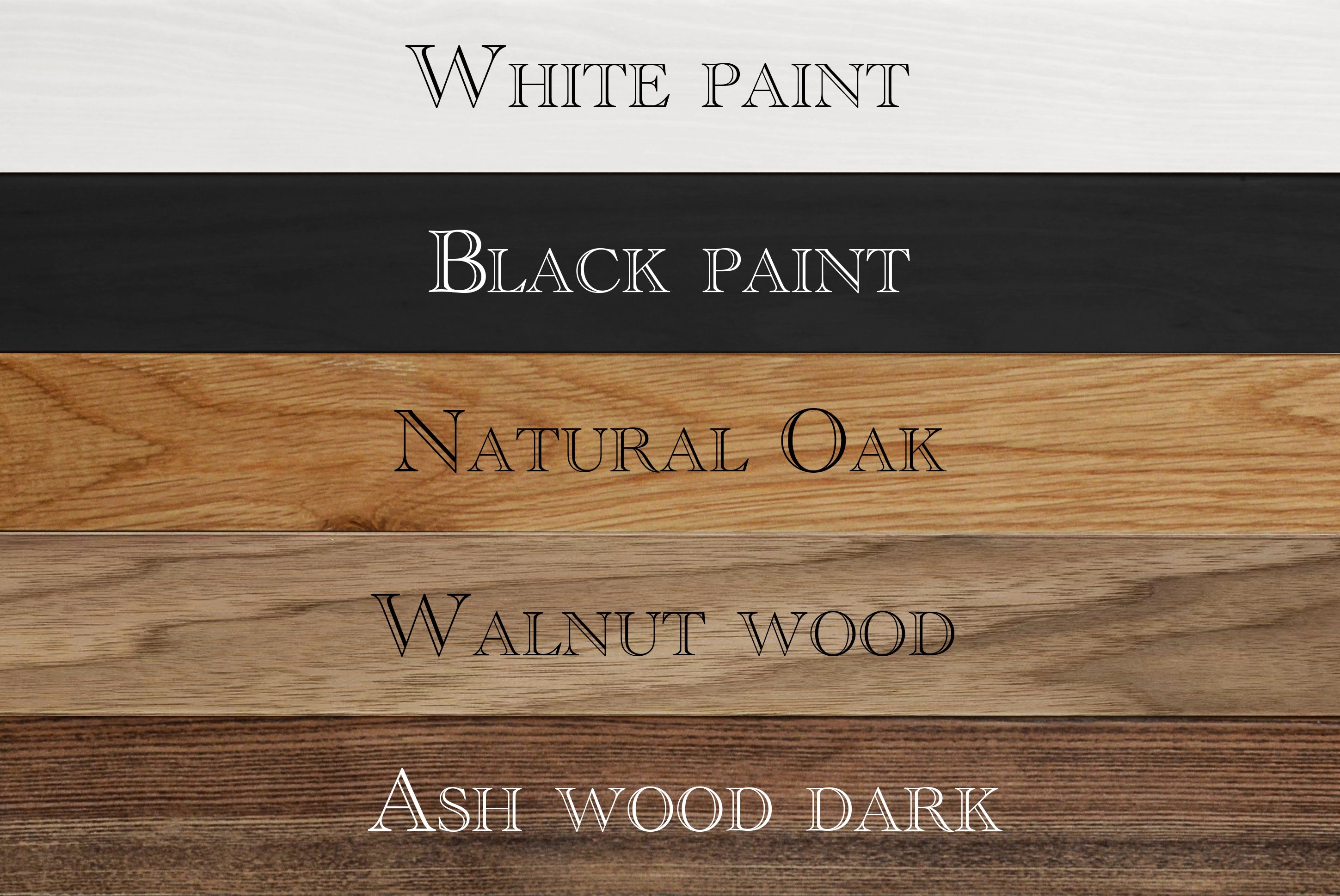
We made it for us, and we made it for all. You can explore different digital display options ranging from 10” to 32” using the link below.

